Menu Behavior
Customize the appearance and interaction behavior of menus. These settings are found in Settings.
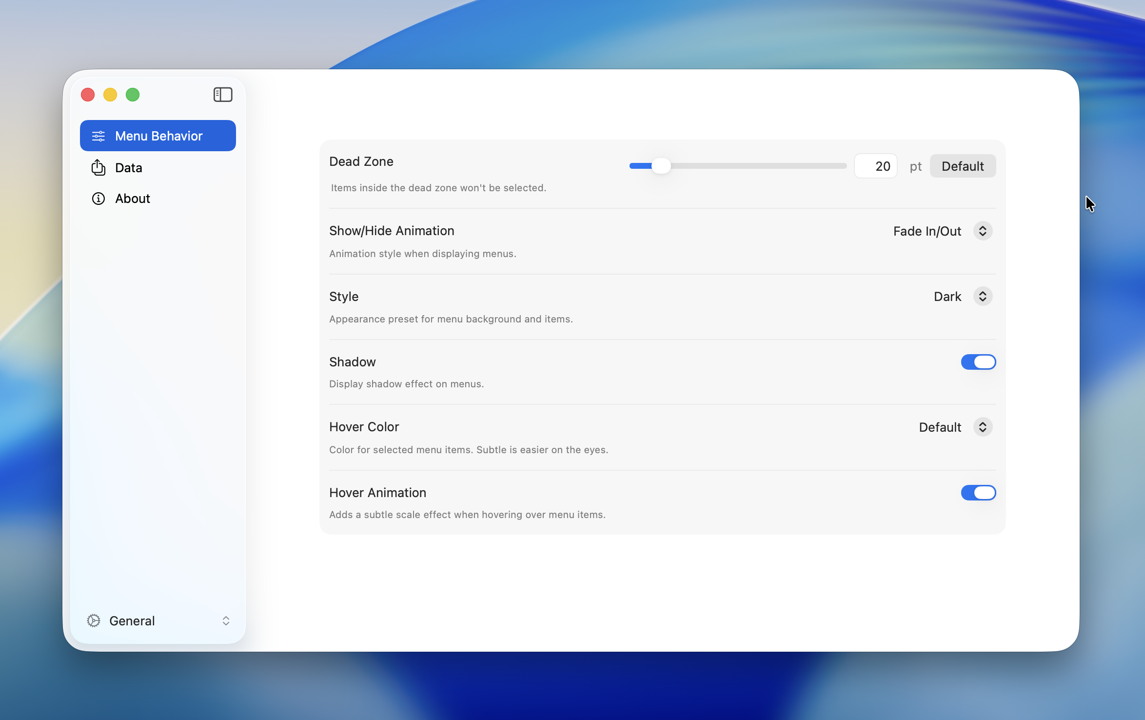
Dead Zone
Sets the radius of the non-interactive area at the center of a Radial Menu. No item is selected while the cursor stays within this zone.
| Property | Value |
|---|---|
| Range | 1 -- 100 pt |
| Default | 20 pt |
TIP
A larger value helps prevent accidental selections. A smaller value lets you select items more quickly near the center.
Animation
Controls the open/close animation of menus.
| Option | Description |
|---|---|
| Fade In / Out | Applies a fade animation when both opening and closing the menu |
| Fade In Only | Applies a fade animation only when opening. The menu disappears instantly on close |
| Off | No animation. The menu appears and disappears instantly |
Default: Fade In / Out
TIP
Turning off animations improves menu responsiveness.
Appearance
| Setting | Options | Default | Description |
|---|---|---|---|
| Style | Dark / Light | Dark | Switches the menu background and text color |
| Shadow | On / Off | On | Shows or hides the drop shadow behind the menu |
| Hover Color | Default / Subtle | Default | Highlight color for the selected item. Subtle uses a more muted tone |
| Hover Animation | On / Off | On | Applies a scale (shrink) effect when hovering over an item |
Hold Repeat
When enabled, holding down a menu item automatically repeats its action. This is useful for actions you want to fire multiple times in quick succession — such as repeated undo, zoom steps, or nudging an object.
Only keyboard shortcut and macro actions support repeat. Other action types (e.g., submenu, app launch) are not repeated.
| Setting | Range | Default | Description |
|---|---|---|---|
| Hold Repeat | On / Off | On | Enables or disables hold-to-repeat |
| Initial Delay | 100 – 2000 ms | 500 ms | Time before the first repeat fires |
| Repeat Interval | 20 – 1000 ms | 100 ms | Time between each subsequent repeat |
How It Works
- Click a menu item — the action fires once as usual
- Keep holding the mouse button — after the Initial Delay, the action fires again
- While still holding, the action continues to fire at the Repeat Interval
- Release the mouse button to stop
If you drag to a different item while holding, the repeat timer resets and starts over for the new item.
TIP
Lower the Repeat Interval for faster repetition. Increase the Initial Delay if you find actions repeating unintentionally.
INFO
Hold Repeat only works when the menu stays open after executing an action. Items configured to close the menu on execution will not repeat.